Buttons
A collection of button styles exist to visually prioritize the possible actions in your application. Styles include the color, size and position of the buttons. Applying these button styles correctly will help the user focus on the most likely next action.
By prioritizing the user flows in your application you will know which flows are most likely to be used by the majority of users. One way of making these most likely paths clear to the users is by applying the appropriate button styles.
Four main button styles exist:
- Primary button: The most likely action the user will take. On desktop and tablet size interface, this button is almost always positioned in the top right corner of the window or it’s attached at the end of the content in the main content area.
- Secondary button(s): Functionality that many users will need but without which the application pages would still work. The secondary button(s) are located to the left of the primary button on desktop and tablet size interface.
- Tertiary button(s): Functionality that isn’t often used by the majority of users should be styled and positioned as tertiary buttons. Example: exporting or deleting a viewed document.
- Kill button: Functionality that performs a deletion or rejection action. These buttons are visually styled to alert the user and are most often placed in pickers to confirm an action. Example: confirming the deletion of a document.
It’s worth spending some time reviewing functionality such as invoice creation and viewing in Tradeshift to see these principles in action.
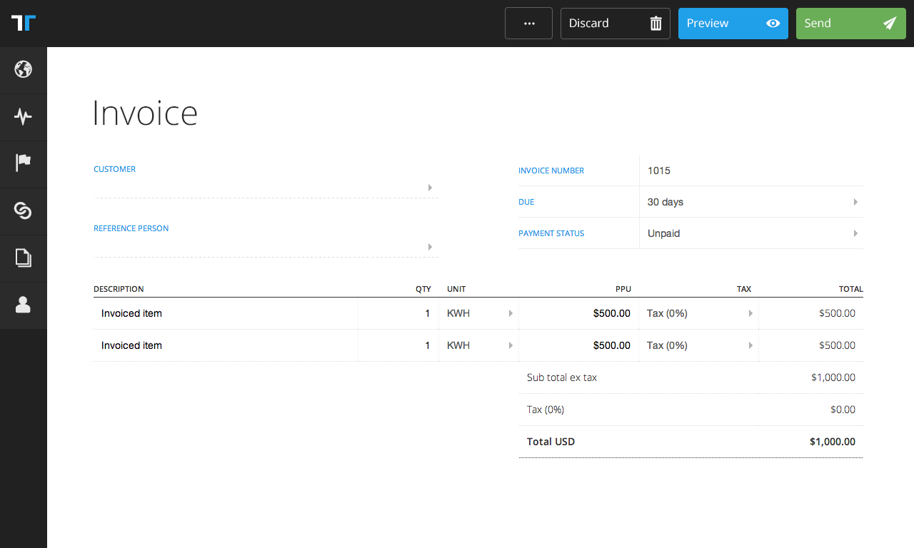
Above is the invoice creation screen. The Send button is primary for this functionality. Preview is secondary and Discard is tertiary. A number of other tertiary actions are grouped within the triple-dot (···) icon. These are actions such as importing document contents from a file, sending a test email with the document attached, etc.
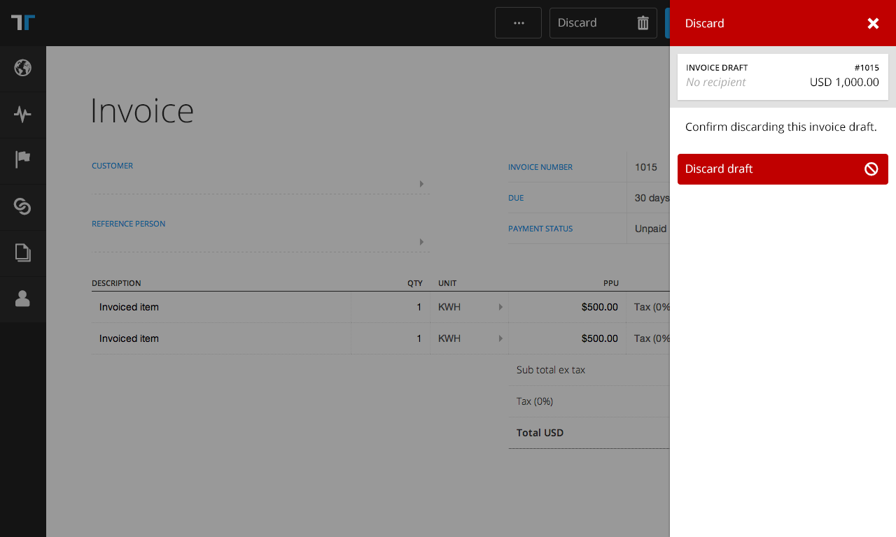
Above is a Kill button which confirms the action of deleting a document. It’s styled to indicate the destructive nature of it’s action.