Navigation Items
Menu items can be inserted in the Global Menu to provide direct access to your app.
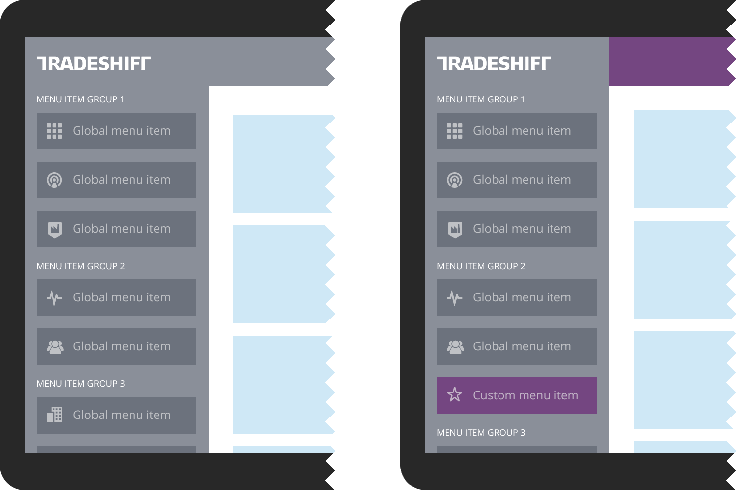
An application icon must be provided as well as a name for your application. A highlight color can be specified for your menu item, allowing integration of your visual identity in combination with your custom icon.
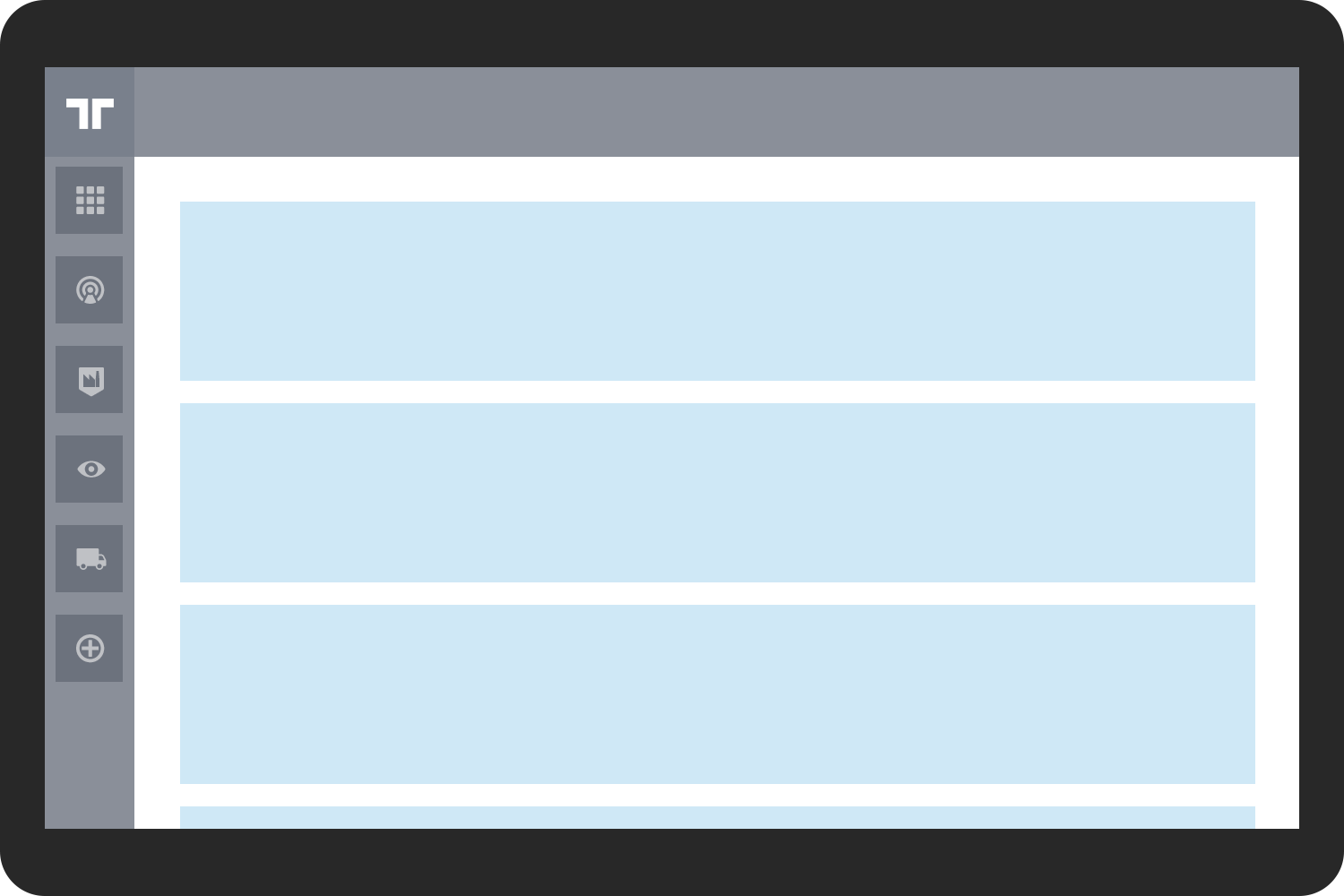
Shortcuts are only available in tablet size and are stacked vertically along the left side of the screen under the Tradeshift logo mark. The shortcuts are basically global menu items that have been defined to also appear in the shortcut list. This means that the shortcuts are a subset of the global menu items. Only specify your global menu item as a shortcut if frequent and repeated access to your functionality on mobile devices is necessary.
TopBar
The Topbar can be customized in a few different ways.
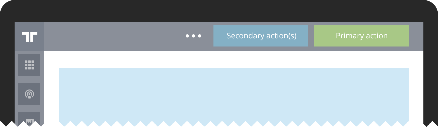
When using the TopBar to present buttons, the actions assoicated to the buttons are expected to manipulate the entirety of page contents; they are "top level" actions. The buttons are also contextual and can change with application state.
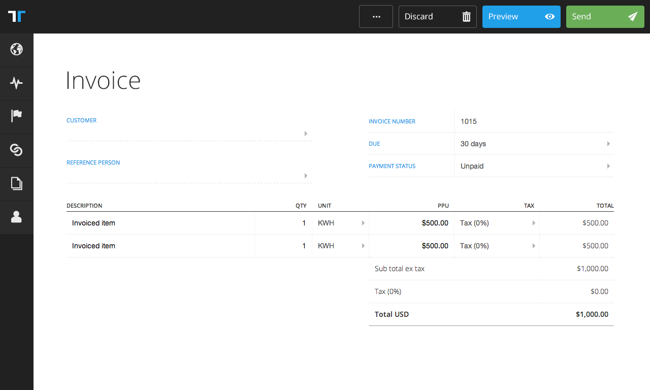
The invoice creation example has document delete, save and send as contextual actions. These actions modify the entirety of what's on the page. More fine-grained controls, such as adding lines, belong to the contents of the document, and should never appear in the contextual bar as actions. An alternative example (connector app and connections page) is when the page contains a collection of objects. In this case, the contextual action of adding another object to the collection is allowed as contextual action, as it alters the collection, being the highest level on that kind of page.
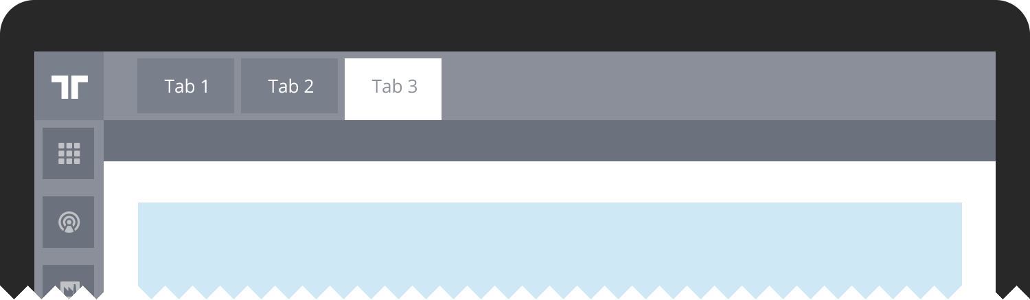
The TopBar can also contain tabs with the purpose of splitting related contents into subsections that can be processed individually in any given order. An example is this documentation.
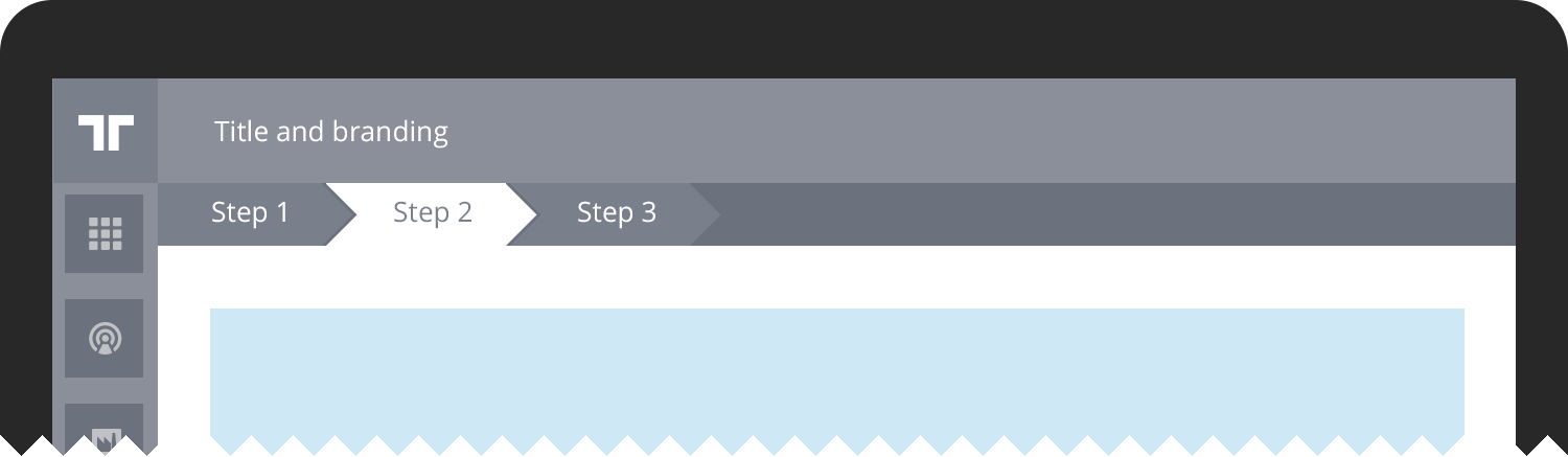
When a tabbed navigation is preferred but there's a requirement for users to process all tabs in order, the progress-tabbed TopBar is used. Note that the progress-tabbed navigation leaves ample space for a flow headline, by keeping the progress tabs below the TopBar space. Progress-tabbed navigation works well for setup flows where all steps are required, such as a custom registration flow.
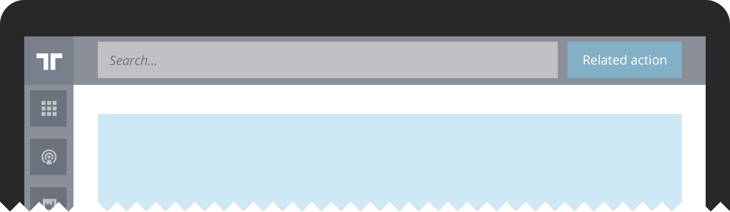
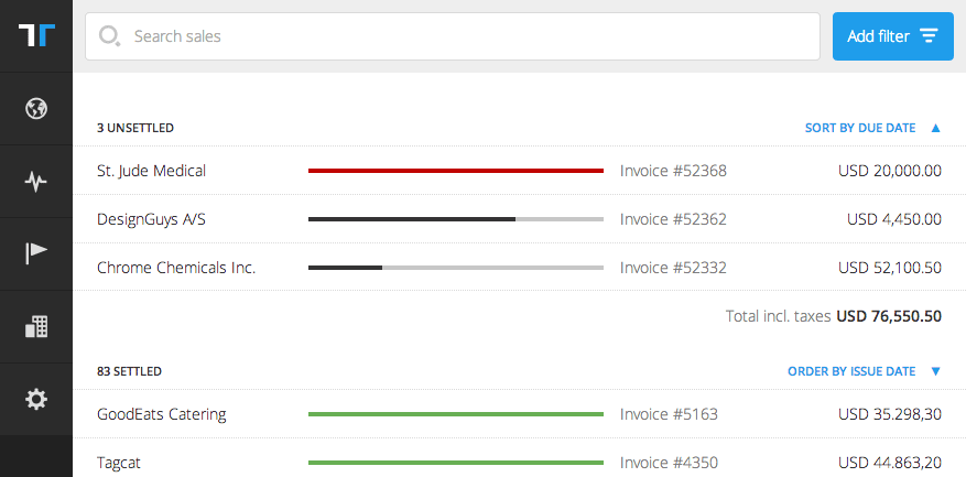
For managing complex lists the TopBar can be completely exchanged with search and filter functionality. This is especially usable for long lists, such as the documents list pages.