Tables
The core table designs in Tradeshift aim to be similar to best practices and existing standards. Due to the responsive nature of Tradeshift UI, some extra considerations should be made to ensure that the user can access and understand the information contained. For tables, the following concepts should be considered.
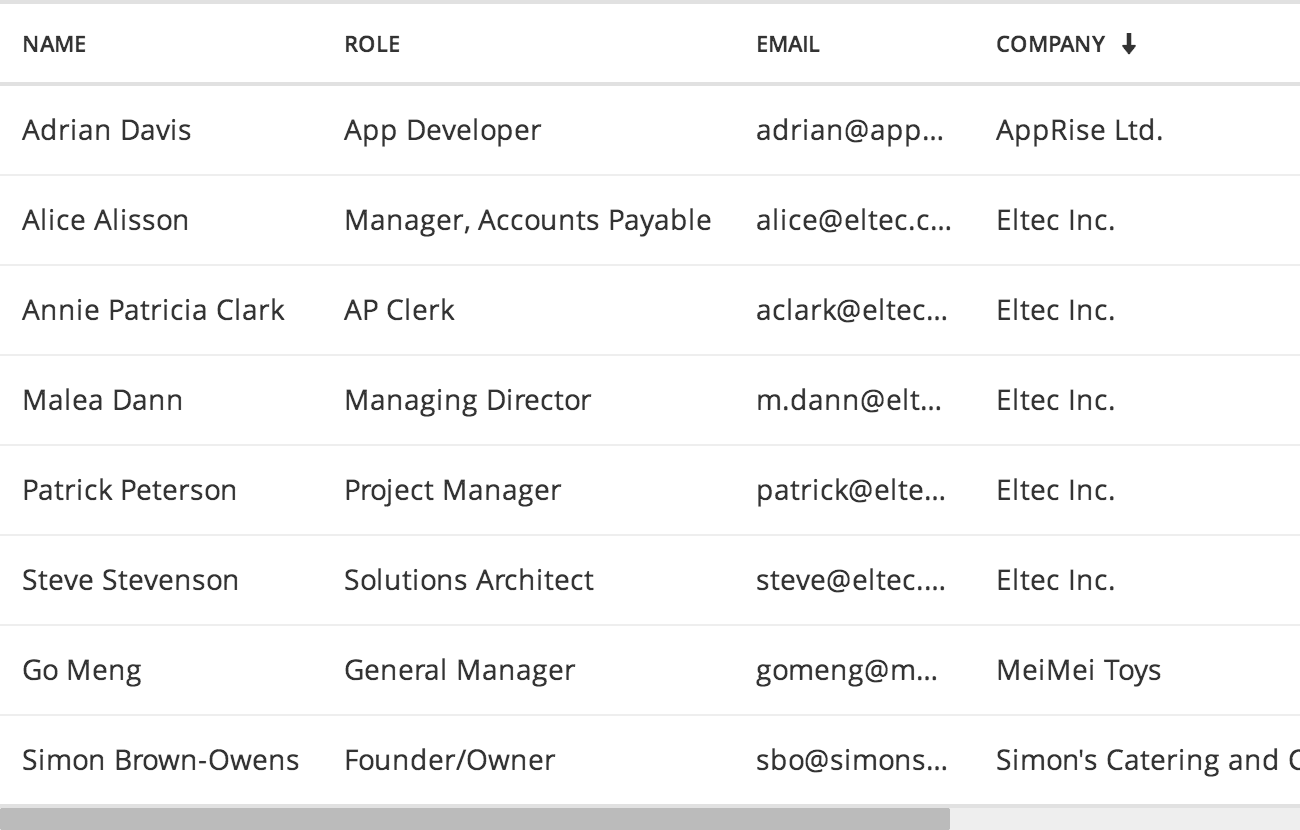
- Line-wrapping: When enabled, text inside table cells will break to multiple lines, if there’s not enough horisontal space. Disabling line-wrapping makes every row same height, as text inside cells is only one line. Proper handling of relative cell-widths and overflow is important when lines are not allowed to wrap.
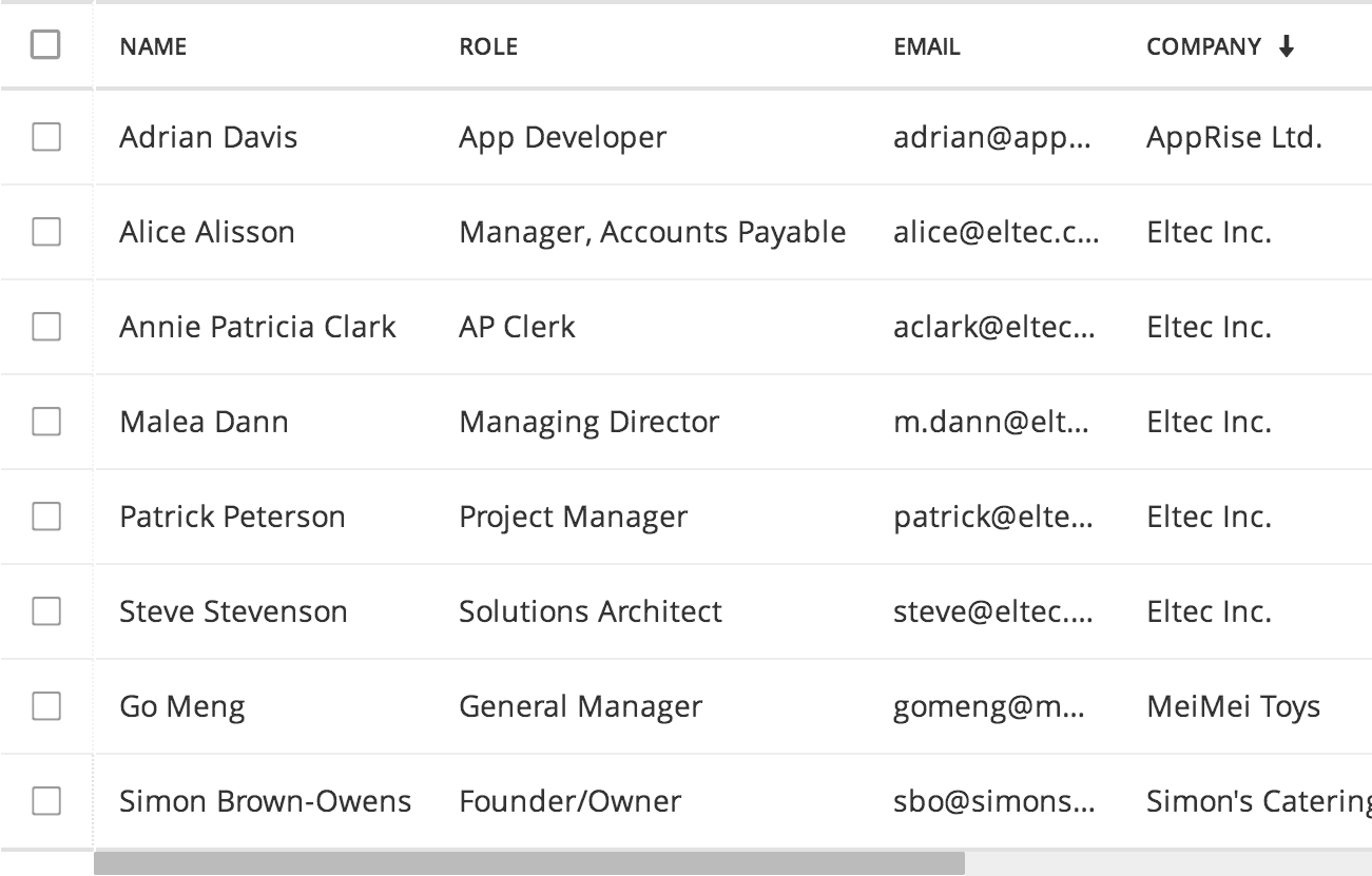
- Row-selection: When enabled, each line has a checkbox in the first left column. This column is fixed, so if the table scrolls horisontally, the selector (first) column stays in place. This allows the user to make selections while browsing all columns.
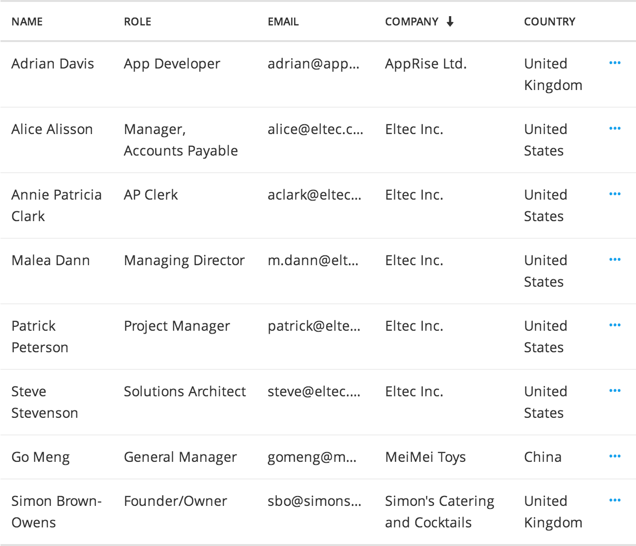
- Clickable rows: In many cases table rows represent single objects and are clickable. This is symbolised by having a last column containing three dots (···).
- Responsive column handling: To better adapt to the available screen space – mainly width – careful consideration of text-overflow and hiding/showing columns should be done. In cases where an entire row is clickable and links to an object, columns can often be left out in small-device table views, as the contents of these columns will be visible on the object anyway.
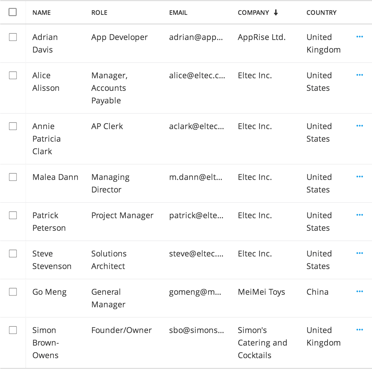
When line-wrapping is disabled, text in cells stay on one line keeping rows same height. Enabling row-selection, provides a checkbox in the first column, that is fixed on a scrolling table.
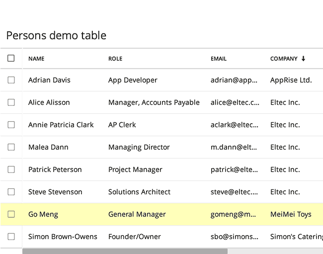
Here line-wrapping is enabled so text in cells flows into multiple lines. Row-selection is disabled, so there’s no checkbox per row.
Row selection
The video below visualises how bulk actions (light blue bar) appear when rows are selected. The bulk actions are only possible when row-selection is enabled.
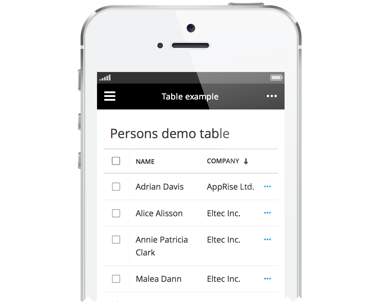
Small device considerations
For smaller screens it’s worth deciding which columns to hide, if any. Aim at scrolling in only one direction (vertical) whenever possible. In the example below, the lines are clickable (···) and all details can be provided in the object view, instead of trying to get everything into the table.