UI Structure
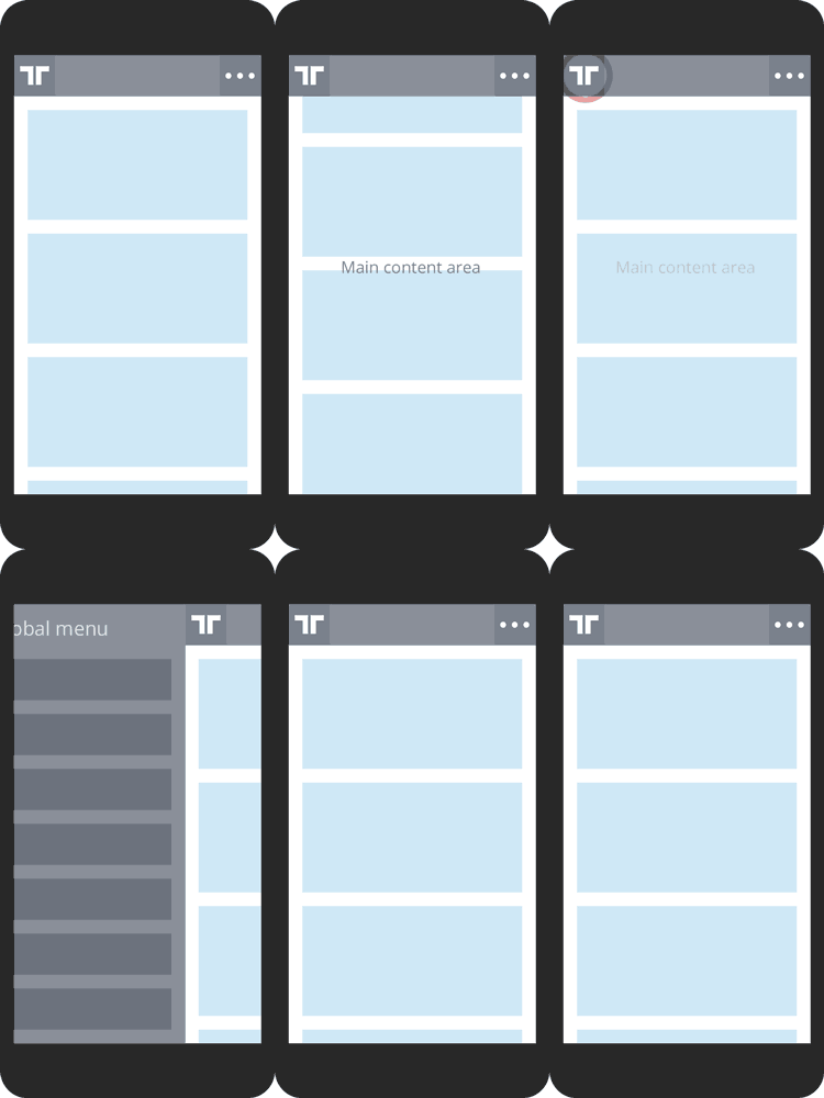
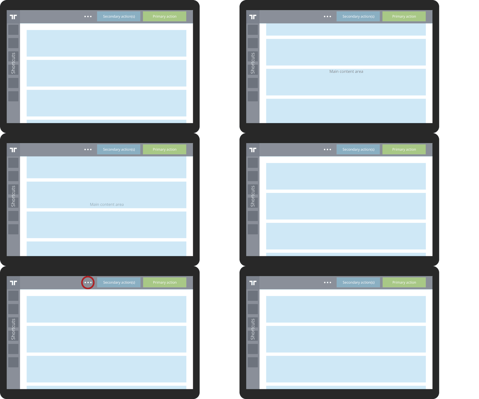
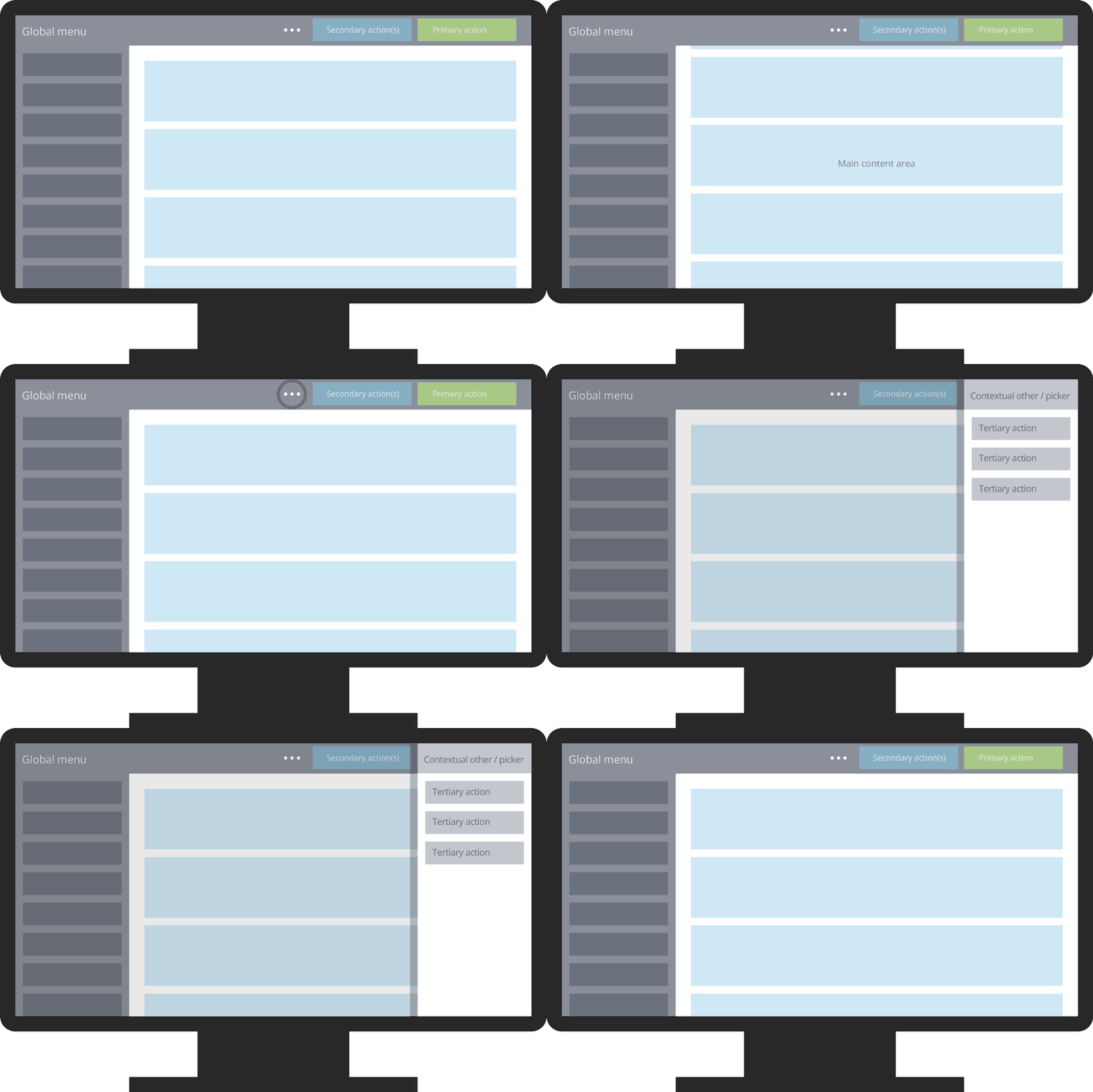
Due to the responsive nature of Tradeshift, you should pay careful attention to how UI elements transform across screen sizes. The application’s navigation elements transform as illustrated in the following.
Small "phone size" devices (<600px): The Main area takes up as much space as possible, leaving only the TopBar with a shortcut to access the Global Menu. The TopBar buttons are moved to a hidden menu. The TopBar will slide out of sight when you scroll, to optimize the screen estate even further.

Medium "tablet size" devices (600px to 1270px): The primary and secondary buttons are visible in the TopBar. Tertiary buttons, which are expected to be used less often, are hidden in a menu. The Buttons page explains these categories in detail.

Large "desktop size" devices (>1270px): The Global Menu is expanded and the TopBar behaves as in "tablet" style.

- Global Menu
- The Global Menu is the primary way for the user to switch between the main functional areas. Core applications such as Document Creation and User Settings provide a Global Menu Item for the user to access these applications directly. The Global Menu is present in all contexts and cannot be disabled. It will, however, expand and collapse based on available screen space.
- TopBar
- The TopBar serves multiple purposes and takes on different appearances. In the examples above, the TopBar contains buttons for actions, but other uses of the TopBar – such as tabbed navigation – are possible.
- Main
- Main is where most task solving takes place. Tradeshift applications are designed on a fluid grid, which lets applications "fluidly" fill out the entire main content area on all screen resolutions, up to 1270 point width. Attempts should always be made, to fill out the main content area – and if this is not possible, you should visually define the boundaries of the functionality.