Option lists and pickers
In most cases Tradeshift’s user interface doesn’t rely on the standard select element for option selection. Instead options are presented in layered lists. This is what we call Pickers.
Structurally the Pickers allow the presentation of more complex selection scenarios than the select element allows. In the concept illustration below, selecting an invoice due date requires either a relative or an absolute value. This can be combined in one seamless flow using Pickers:
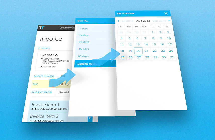
Pickers have been designed to work similarly across different devices and screen sizes, as a picker panel basically is a collection of form elements styled to meet phone styling requirements.
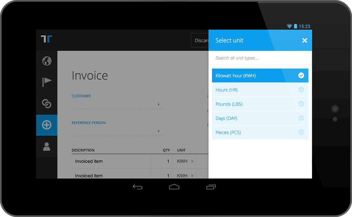
For huge lists with hundreds or thousands of options, a search element can be enabled. In the following example the list of options contains a few hundred unit types. Only the previously used ones are shown. Access to the full list is provided by free text search:
Copy Guidelines
Writing copy for pickers for the most part consists of writing copy for a bunch of individual elements that can be found elsewhere in the product. There are essentially three distinct groups of copy when it comes to pickers:
- Title: The title should be as descriptive as possible regarding what the goal of the user is. Furthermore, the title should match the copy of the element that triggered the opening of the picker.
- Body: The body can include two different elements: clarification/explanation copy, and value selectors. The selectors should follow the same guidelines as throughout the rest of the product. The clarification/explanation copy should be as clear as possible. No personality, no humor, this is strictly a help text in a complex flow, and its only goal is to clarify the actions expected of the user.
- Buttons: Some pickers will include buttons. When they do, these follow the rules of buttons in the rest of the product. Read more about buttons (including copy) here, or read the in-depth section on button copy
Ways of presenting options
Picker’s are used whenever you need a field value populated from existing data. I.e. if the user clicks an input element and a value is returned to a field on the existing page, a picker should most often be used. Here are the standard option.
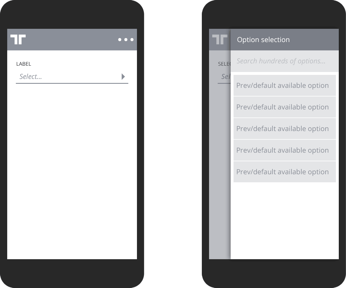
- Single value selection
- Multiple value selection
- Advanced value selection: Drill-down with nested values in a hierarchy of pickers (tree structure)
Option manipulation
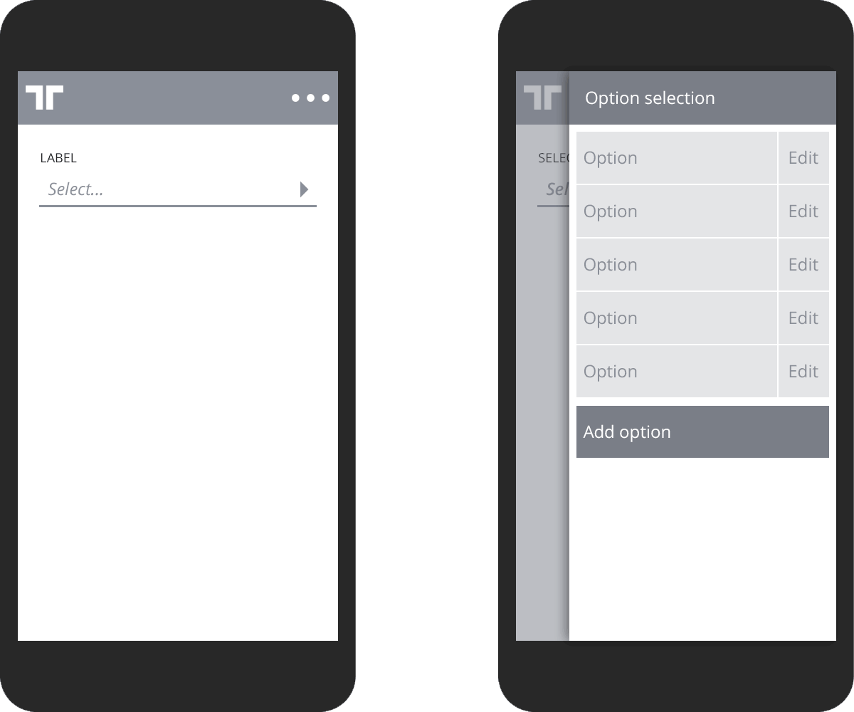
- Add option
- Modify option
- Remove option (part of edit)
Navigation options
- Object navigation hub (click invoice in documents list and get options in picker)
- Advanced/custom use: Invoice line transformation across devices
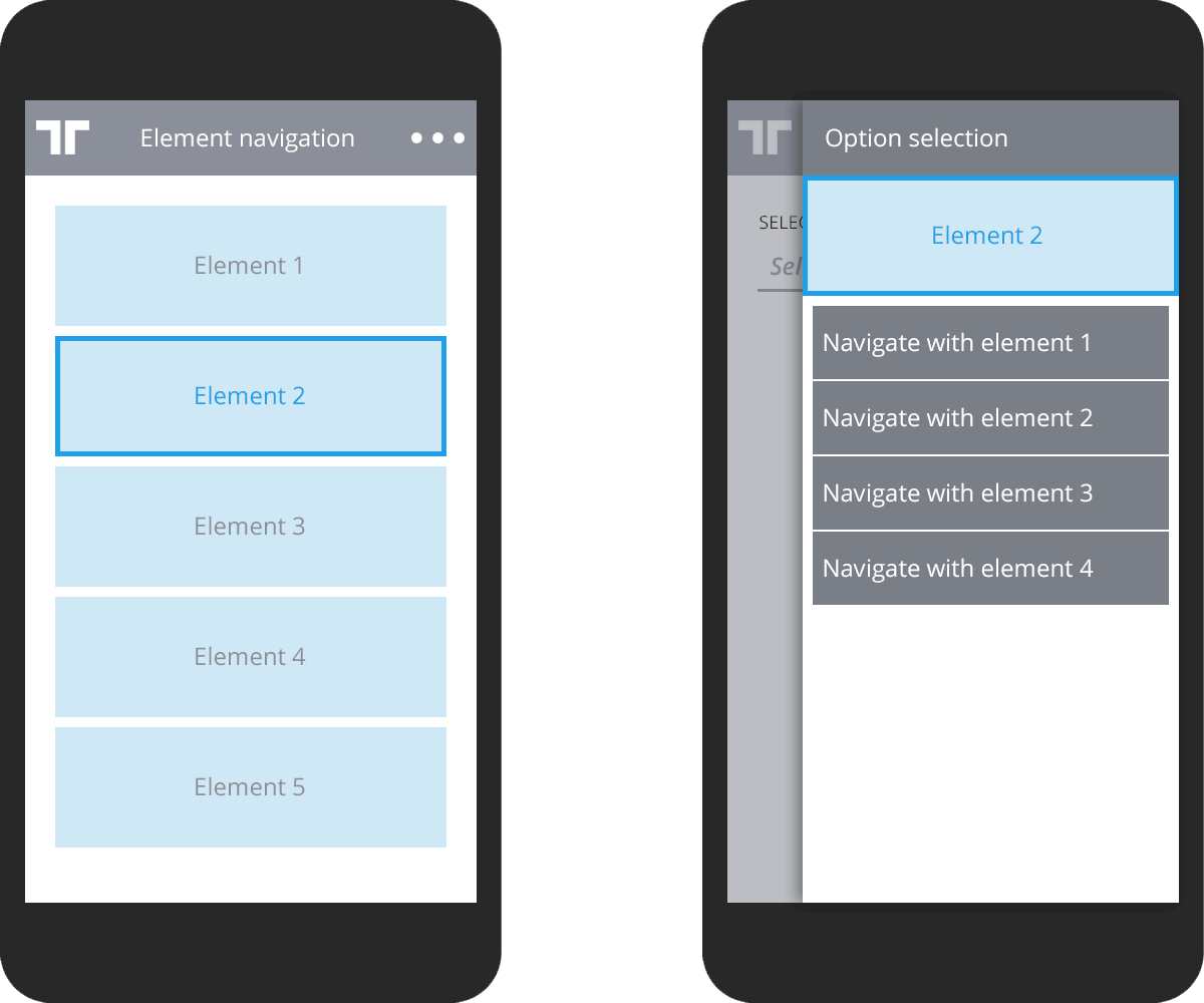
Simple options
Checkboxes (multi select or single value boolean) or radio buttons (single select) can be used when the following is true:
- Less than 5 options in list
- Options cannot be manipulated
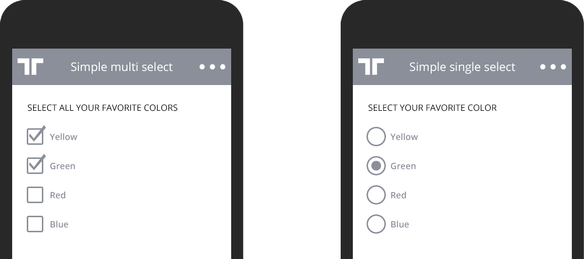
The standard select element/dropdown is never used. In cases that is needed, always use a picker as this provides a more consistent user experience for value selection.